

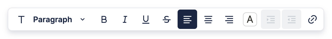
Formatting Toolbar
The Formatting Toolbar appears whenever you highlight text in the editor, and is mainly used for styling.
Custom Formatting Toolbar
If you want to change the buttons/dropdowns in the Formatting Toolbar, or replace it altogether, you can do that using a React component.
You can see how this is done in the example below, which has a custom Formatting Toolbar with four items. The first three are default items to toggle bold, italic, and underline, while the last one is a custom button which toggles the text and background colors to be blue.
CustomFormattingToolbar is the component we use to replace the default Formatting Toolbar. You can see it's made up of a bunch of other components that are exported by BlockNote. Read on to Components to find out more about these.
After creating CustomFormattingToolbar, we tell BlockNote to use it inside BlockNoteView. Changing UI Elements has more information about how this is done.
Changing the Block Type Dropdown
If you create a custom block and want to add it to the block type dropdown in the default Formatting Toolbar, you can do that through the blockTypeDropdownItems prop of the DefaultFormattingToolbar component:
<DefaultFormattingToolbar
    {...props}
    blockTypeDropdownItems={[
        ...defaultBlockTypeDropdownItems,
        {
            name: "Image",
            type: "image",
            props: {
                src: "https://via.placeholder.com/1000",
                alt: "image",
            },
            icon: RiImage2Fill,
            isSelected: (block) => block.type === "image",
        },
    ]}
Find out how to replace the Formatting Toolbar in Replacing UI Elements.
Components
It might seem daunting to create your own Formatting Toolbar from scratch, which is why BlockNote provides React components that you can use which match the default styling.
Default Components
BlockNote exports all components used to create the default layout - both the toolbar itself and the items in it. Head to the default Formatting Toolbar's source code to see all the components that you can use.
Custom Components
BlockNote also provides components that you can use to make your own toolbar items, which also match the default styling:
// Custom dropdown.
type ToolbarDropdownProps = {
  // Array representing the items in the dropdown.
  items: Array<{
    // Item name/text.
    text: string;
    // Icon next to the text.
    icon?: IconType;
    // Function to execute on click.
    onClick?: (e: MouseEvent) => void;
    // Condition for when the item is selected/active.
    isSelected?: boolean;
    // Whether the item should be clickable.
    isDisabled?: boolean;
  }>;
  // Whether the dropdown should be clickable.
  isDisabled?: boolean;
};
const ToolbarDropdown = (props: ToolbarDropdownProps): JSX.Element => ...;

// Custom button.
type ToolbarButtonProps = {
  // Main tooltip, which is shown on hover.
  mainTooltip: string;
  // Secondary tooltip, usually showing the keyboard shortcut.
  secondaryTooltip?: string;
  // Icon for the button.
  icon?: IconType;
  // Function to execute on click.
  onClick?: (e: MouseEvent) => void;
  // Condition for when the item is selected/active.
  isSelected?: boolean;
  // Whether the item should be clickable.
  isDisabled?: boolean;
  // Child components, usually just the button text. If no children are
  // given, make sure to provide an icon.
  children?: any;
};
export const ToolbarButton = (props: ToolbarButtonProps) => ...;